Improving conversion rates by 3% and increasing user engagement for Blenders Eyewear
Blenders Eyewear is a sunglasses and accessories company founded in 2012 by Chase Fisher. The brand stands for offering stylish, vibrant, and affordable eyewear designed for individuals who embrace an active lifestyle.
Overview
Challenges
responsibilities
+
User research & analytics
+
User testing (A/B testing)
+
Low and high fidelity wireframes
+
Responsive/mobile design
+
UI and UX design
+
Art direction
+
Interactive prototypes
+
Internal Design system
team
+
+
+
+
Roman (Lead UI/Product Designer)
duration
12 months


Design creates culture. Culture shapes values. Values determine the future.
+ Robert L. Peters
_01
blog & seo optimization
Create improved and well-designed blog sections UX to introduce better quality content for SEO and organic growth. Craft clear UI design and relatable content to improve user experience, reducing bounce rates and signaling content relevance to search engines. Find ways to encourage sharing, boost a site's credibility and SEO rankings.
_02
main navigation
The goal for this solution is to make a structured, easy user interface to help shoppers navigate main and sub-categories for the store, get quick exposure to Specials/Featured sections. Reorganize content structure and make the mobile experience for navigating more straightforward and organic to the users. Offer quick access to support.
_03
homepage redesign
_04
product detail page
Optimize the PDP by increasing upsells and cross-selling, conversion rates and improving checkout experience. Introduce more hierarchy on the page, increase interaction with the product gallery, optimize placement of CTA for adding to cart. Add more ways to offer bundled products to increase Order Total.

I have used Google Optimize for A/B testing, Shopify Internal Analytics tool for tracking sale conversions after new design launches and Hotjar for tracking and noting friction points for current and past users. This is just a snapshot of few important insights about the shoppers in the past two years of analytics.

Main navigation is the primary tool for incoming users and existing customers to find the right product or quickly navigate to the category they are most interested in. I have spent a large amount of time creating and testing different design variations and layouts for the mobile menu. The biggest change is introducing the standard hamburger menu (common navigation pattern icon) and shifting it to the side instead of just having separation by gender. Our team has heavily utilized Google Optimize and multi-variate A/B tests to find the best solution that offered the highest conversion rate for both Desktop and Mobile experiences.
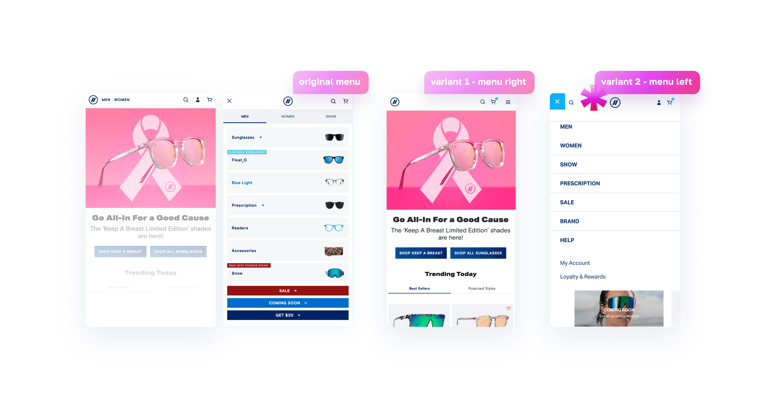

We used more sub tests to pin point to the right treatment of the sub-categories when users try to drill down one level under the main category. In this case, we found that most users prefer to use collapsible navigation by title. I believe it was due to users not liking to scroll up and down when they have to see all items at the same time on their mobile browser, they would rather click on specific category they are most interested in instead. The winning layout was the results of over 300,000 active sections, the potential growth of conversions is around 2.8% which is the increase of over 0.25% from old menu (estimated $2500+ daily sales).

My task here was to enhance user navigation by providing easy access to main product categories, improving the overall user experience. Additionally, a well-crafted desktop menu needs to showcase promotions, highlight new arrivals, or feature best-selling items, thereby boosting sales and conversions. By strategically placing important information within the menu structure, Blenders can effectively capture users' attention and drive them to explore specific sections or products, ultimately leading to increased sales opportunities. The focus here became less on product thumbnails but more on promotional sections in the menu, which proved a successful conversion technique in the next few months.
Testing desktop designs for highest converting version


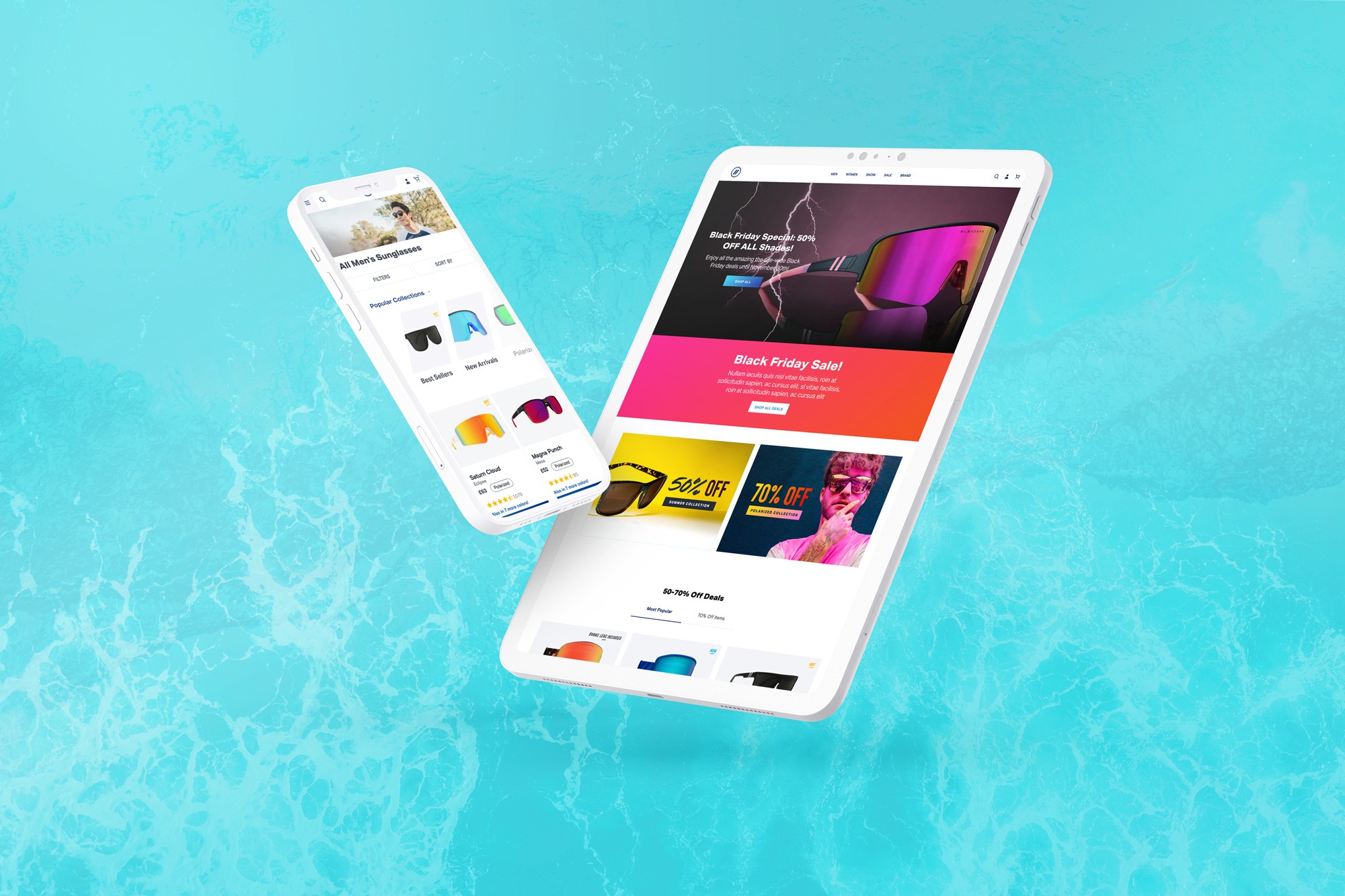
Homepage gets on average over 300k daily users, so our team took care making gradual improvements to its sections and optimizing the user experience. Our team's goal was to increase traffic to the product detail pages (PDP) and encourage higher conversion rate. I wanted to introduce more structured sections with better hierarchy to promotional items and also allow for better blog content to improve SEO presence. The original homepage had too many disjointed blocks of content and large amount of products with lower sections getting very little user interaction (Hotjar < 5%).

I was very focused on cleaning up the experience above the fold. The large grid of products proved to be ineffective because users rarely interacted with lower sections. In order to improve this, I created Featured Tiles early on the page that also integrated well with marketing campaigns, combining products into the separate tabbed section with 2 rows instead of 4. This proved to be more successful from testing results. The new Featured Categories proved to be highly converting section, users actively wanted to click to find out more about categories (Hotjar > increase 10%) compared to not having this option before. For finding the most successful variant, we always ran 2-week Ab/B testing with over 200,000 impressions per experiment.


This was a more granular experiment to find the most high-converting option of the cross-sell section. After analyzing the results, we found out that users did not like scrolling more on the PDP page, instead they preferred a more simple option where they are given/presented with three related deal options right away. This was a very interesting discovery for the user behaivor but also explains that users are not willing to spend exra time ‘discovering’ something more on a product they are already sold on.


Signature series landing

3%
check out Other projects:
